Location: Dollywood. Pigeon Forge, Tennessee
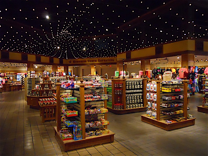
Making the most of a tight budget, a desire to both improve the shoppers’ experience and increase sales, this new lighting design altered the fundamental feel and flow of an existing retail space. The space suffered from mixture of radically different ceiling heights, and outdated lighting sources and technologies. The new lighting design focuses guests on the merchandise, softens ceiling transitions, and invites guests to explore the entire store.
The building is two stories, with a central full-height atrium. Primary concerns were eliminating the cavernous feel in the center of the store, the claustrophobic feel in the low ceiling perimeter areas, and creating a more cohesive shopping experience. The addition of festoons just above the first floor atrium level creates a celebratory, more intimate atmosphere, and visually reduces the contrast between the two ceiling heights. Narrow spotlights hidden amongst the festoons highlight merchandise shelves and kiosks, drawing visitors naturally from one display to the next.
Existing track in the lower ceiling areas either remained in place or was repositioned for better illumination angles. All old heads were replaced with highoutput LED accents to reduce energy consumption and maintenance, while boosting levels on displays and perimeter walls.
To accommodate the store’s ever-changing product displays, adjustable track heads can be re-focused to showcase each new shift in merchandise, providing easy options for a wide array of configurations.
The merchandise now shines as the brightest element in the store, highlighting the products as the architecture fades gently into the background.
Awards: 2016 IES Illumination Award of Merit.
Photos: Lara McKay


